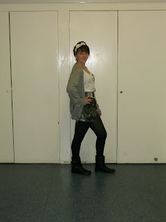
These are the next lot of test shots that i have taken of my same model, i tried some more poses from different angles. I would like the ones where my model is sitting on the floor for mny contents page, i think it would look good along the bottom and if she was wearing the right clothes this would create a good style for my magazine. The one where her arms are up i thought this would be good to use to put the title inbetween of her hands, im not sure if i am going to do this or not yet though. I want my model to be wearing colours that will look good with the pastel colour of my background which i think will be a turquoise or blue colour like the ones in my mock. For my front cover i want my model to be looking at the camera i think, i am going to take some more photos and with another model as i want two. I want a different one on my contents page to my front cover and double page spread. I want to have at least three different shots, i think i want a midshot on my front cover and definatly a long shot on my double pag spread but with more pictures aswell.


1 comments:
some really good work so far. although i think your earlier test shots were more successful (they are better photos). your shots would be better taken at home where you can create a more relaxed atmosphere, that way your subject will look more relaxed.
make sure you post as often as you can this week as you work on your draft.
Post a Comment