Pages

Friday 6 May 2011

Final Words ..

I hope you enjoy looking at my blog and seeing how my skills have progressed throughout. I am pleased with my final coursework and i hope that you can see how it has improved since my prelim activity. I have learnt a lot since starting the course, my computer skills have improved and i feel a lot more confident using them now.
 Hanna (:

Thursday 7 April 2011

Final Magazine

Prelim


Activity One

Activity 1 - final .

Friday 25 March 2011

Activity Two

activity 2 final

Activity Three

3. What kind of media institution might distribute your media product and why?

I think that IPC would be a suitable distribution company for my magazine, this is because it is responsable for distributing over sixty other media products. I think that this would be appropriate because they distribute so many other things to different target markets including fashion magazines for example 'LOOK' which relates to my magazine because it is fashion inspired and they would have a target market for this. I think there would be a space in the market for my magazine but it would sell well along side magazine like 'NME' which IPC also distribute because it is targeted at around the same audiance of teenagers and young adults however it is not exactly the same genre therefore there would be no competition agaisnt any of the other magazines that they distribute.

Activity Four

activity 4 final

Activity Five

activity 5 final

Activity Six


I have leanrt a lot about using new technologies in this course. The main programs i used are blogger, photoshop and microsoft word. Other ones i have used are displayed here in my animoto. Each different technolgy helped me in a different way to complete this project.
I learnt how to firstly use blogger which helped me do my research because I had somewhere to put it straight away and it also helped with organising the work I was doing, I also learnt how to use Scribd which is a program that lets me upload on to my blog, this was vey useful and is easy to use. Animoto is another program I learnt to use which is a good way of presenting ideas.
Photoshop was the main one i used to complete my magazine, i found this difficult to work at first but once i had figured it out it was better and a lot of help it let me edit and change my pictures and text i used in my magazine. It helped me to get my magazine the way i wanted it to look. I think this is definatly a good program to know how to use.

Activity Seven

draft evaluation activity 7

Friday 4 March 2011

Photos for my magazine.


I like this picture for maybe one of the smaller pictures on my double page spread as hopefuly it can bring across the personality of the person and also my magazine. I also really lik he outfit in this picture.


I particually like this style of picture for my double page spread as a few people from my feedback said that they thought the double page spread picture was one of the better ones.


This is also a good close up picture to have to put as one of the smaller pictures on my double page spread.


I like the face pose in this picture and think that it will attract the audiences attention because she is looking straight into the camera with quite a stern facial expression.


These four pictures above are the style i like for my double page spread, i like that they worked well on my draft and i want to do ths again, this is why i have taken a few different images to have a look at what looks best.


I like this picture above for the double page spread and i also want to make sure that i include all of the outfits i have used in my magazine.


These are more of the styles for my contents page, i hope that in my selection of these ones i will be able to pick the best and use it liek in my draft but hopefully make it stand out abit more.

I also really like this and the picture below for my double page spread, i like the style of it.


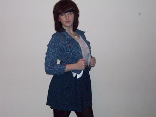
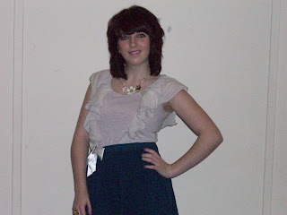
These are my pictures for my magazine i am making, i have retaken my pictures having my feedback into account. I particullary like the longshot pictures for the double page spread and i would still like to use the same style photo as on my draft for the cover and the contents.I have picked these outfits on purpose to go with the style of my mgazine and hopefully they will work well with my pastel theme colour. I also prefer my models hair on these pictures compared to the ones that were on my draft. I have taken more pictures for this lot of test shots because i wanted more of a variety to choose from, i also think that these pictures are of a slightly better quality than my other ones.

Friday 25 February 2011

Questionnaire Results.

These are the questions that i asked in my questionnaire, i printed off my questionnaire and handed it to people and asked them to look at my drafts and to answer the querstions that i have asked.

1. If you saw my magazine in the shop would it get your attention and why?
2.Do you think that the contents page gives enough information?

3.What else would you like to know about the artist?
4.Do you think there is clear link between the pages?
5.How professional do you think that my magazine looks?
6.Do you think more pictures are needed on my contents page?
7.Do you think there is an obvious colour pallet to my magazine?
8.Do you think that the fonts i have used throughout my magazine work well together?
9.Which picture used do you think is the most appealing?
10.What is something that you thinks need changing in my magazine?

Everybody answered yes to the first question however they stated different reasons for this for example the colour or that the title stands out.
With the second question the majority answered yes but there was an answer saying that more information should be given therefore i will take this into consideration when i am designing my final magaizne.
The answers to question three tell me that the majority of people would like to know more personal things about the artist therefore i think i will maybe do a fact file on the artist aswell or maybe some more personal pictures or questions too.
My magazine could be improved to make it look more proffesional , i think i will do this hopefully by picking the right logo and taking new pictures of my artist.
The people i asked also think that i need some more pictures on my contents page and maybe of other people, so i thought that i could take some of the artist with other people aswell.
Question sevens answers tell me that people can see the link between all my pages and they think that it is the pastel colours, however someone has suggested to use the same pastel colour for both of the backgrounds therefore i will consider this whhen making changes and improving for my final magazine.
Everybody said that they think the fonts i have sused throughout my magazine work well together.
When i asked which picture stood out the most, all of my main three main pictures were chose by different people therefore i want to try and take some more pictures in this style when re-taking my pictures.
The last question had a variety of different answers, they have said to use different colours on the model which i was going to do in my real shots anyway as i want them to relate more with the theme of my magazine and show the same style and another answer was something to make a reader go 'wow' therefore i will think of what i can do to improve this.

Thursday 24 February 2011

Logo

I have decided for my logo that i wanted something to help make my magazine look more like a music magazine. This made me think of instreuments and because i dont want to add anything big to my magazine or anything over the top i have decided to have my logo as a picture of a microphone and this will help to make it seem more like a music magazine.
I have decided to have it as quite a small picture and also to have it somewhere like next to the barcode or the masthead so it is not the centre of attention and my picture should hopefully still be the main attraction.
These are the pictures that i looked at and that i liked to use on the front of my magaizne i dont think that i will use any with colour on because it might not be the same as my colour scheme but if it is black or silver it will work well.