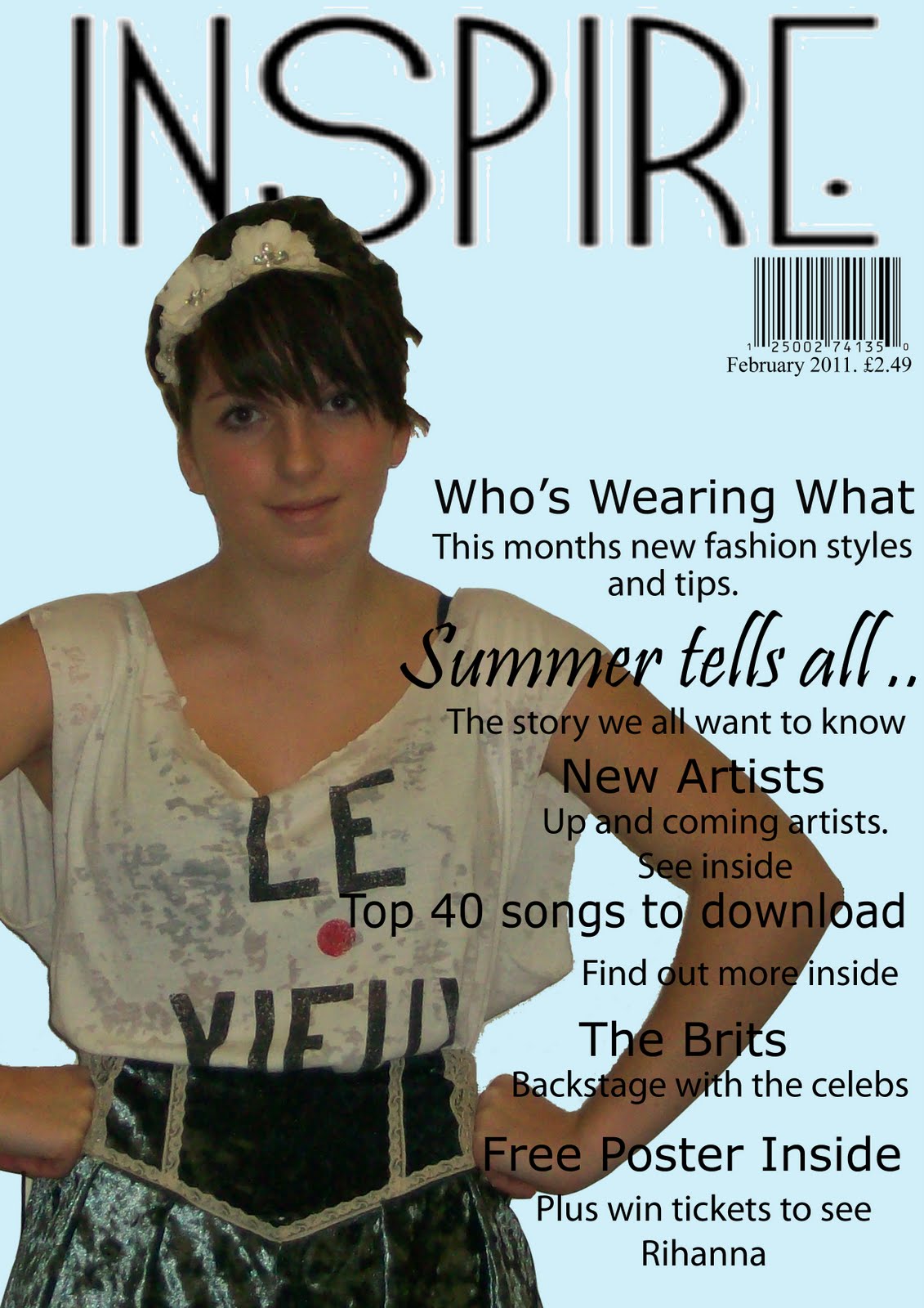
This is the draft for my front cover of my magazine. The process i went through for this was researching first different magazines and what they looked like and then different poses and how i wanted my model to be for my front cover picture, i had decided at the begining that i wanted a midshot for my front cover but still had to experiment with other ideas. I then made three different mocks of different layouts that i could use for my front cover on a word document and then produced one of them on photoshop with picture,colour and text. The difficulties i had were using photoshop, i cut out pictures and used colours and text boxes to creat my mock in photoshop. After my mock is when i took my test shots of my model and first we just took a few but then took around 30 more the next time, however i know that i will need to take loads more for the real thing so that i have more to choose from and hopefully will have some better photos. Also i havnt edited much on this front cover, i have cut out three pictures, used colour and textboxes. I have used four fonts in total, one of them is for my masthead and this continues through my magazine.

This is my draft for my contents page, i also created three mocks for this on a word document of the layout and then also one of photoshop to experiment with colours and fonts. I again found it difficult to use photoshop but one this page have cut out six pictures, used colour and text boxes. I have used four different fonts on this page aswell, three of them are the same as on the front cover. I thought that the font was a good way to show a link throughout of my magzine pages. I have also done this through colour as i have used colours which i think fit the theme and style of my magazine well. i would like to use more editing it the smaller photos on this and will experiment with this a bit more before doing my final piece.

I did the same for this double page spread also with the three mocks plus one mock on photoshop using colour, text and pictures. I have tried to continue to pastel coloured theme onto this page also by using it on the smaller pictures and also slightly in the text. In my final i would like my model to be wearing more pastel coloured clothes to match the theme of my magazine better. I have cut out 10 pictures to create this spread and have used some editing in the smaller pictures.
1 comments:
After looking at this blog post and at your magazine coursework drafts I think you have done well! my favourite page is the front cover as it is different and would get my attention in a shop. I like the blue background and the image used. To improve, you could maybe put the image in the middle of the page an then put writing around.
I like the use of polaroid pictures on the contents page but I think more infomation about what the magazine includes is needed.
Finally, I really like the main image used on the double-page spread but the page does look a bit plain. Maybe you could change the arrangement and use a background colour or image?
Overall, I think you have tried hard when doing this draft. However, you could make the colour scheme more regonisable and include more infomation in the magazine. Well done Hanna!
Post a Comment