1. If you saw my magazine in the shop would it get your attention and why?
2.Do you think that the contents page gives enough information?
3.What else would you like to know about the artist?
4.Do you think there is clear link between the pages?
5.How professional do you think that my magazine looks?
6.Do you think more pictures are needed on my contents page?
7.Do you think there is an obvious colour pallet to my magazine?
8.Do you think that the fonts i have used throughout my magazine work well together?
9.Which picture used do you think is the most appealing?
10.What is something that you thinks need changing in my magazine?
Tuesday, 15 February 2011
Friday, 11 February 2011
Drafts.
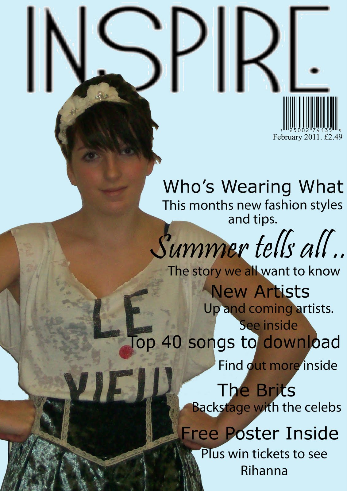
This is the draft for my front cover of my magazine. The process i went through for this was researching first different magazines and what they looked like and then different poses and how i wanted my model to be for my front cover picture, i had decided at the begining that i wanted a midshot for my front cover but still had to experiment with other ideas. I then made three different mocks of different layouts that i could use for my front cover on a word document and then produced one of them on photoshop with picture,colour and text. The difficulties i had were using photoshop, i cut out pictures and used colours and text boxes to creat my mock in photoshop. After my mock is when i took my test shots of my model and first we just took a few but then took around 30 more the next time, however i know that i will need to take loads more for the real thing so that i have more to choose from and hopefully will have some better photos. Also i havnt edited much on this front cover, i have cut out three pictures, used colour and textboxes. I have used four fonts in total, one of them is for my masthead and this continues through my magazine.

This is my draft for my contents page, i also created three mocks for this on a word document of the layout and then also one of photoshop to experiment with colours and fonts. I again found it difficult to use photoshop but one this page have cut out six pictures, used colour and text boxes. I have used four different fonts on this page aswell, three of them are the same as on the front cover. I thought that the font was a good way to show a link throughout of my magzine pages. I have also done this through colour as i have used colours which i think fit the theme and style of my magazine well. i would like to use more editing it the smaller photos on this and will experiment with this a bit more before doing my final piece.

I did the same for this double page spread also with the three mocks plus one mock on photoshop using colour, text and pictures. I have tried to continue to pastel coloured theme onto this page also by using it on the smaller pictures and also slightly in the text. In my final i would like my model to be wearing more pastel coloured clothes to match the theme of my magazine better. I have cut out 10 pictures to create this spread and have used some editing in the smaller pictures.
Friday, 4 February 2011
Next Test Shots


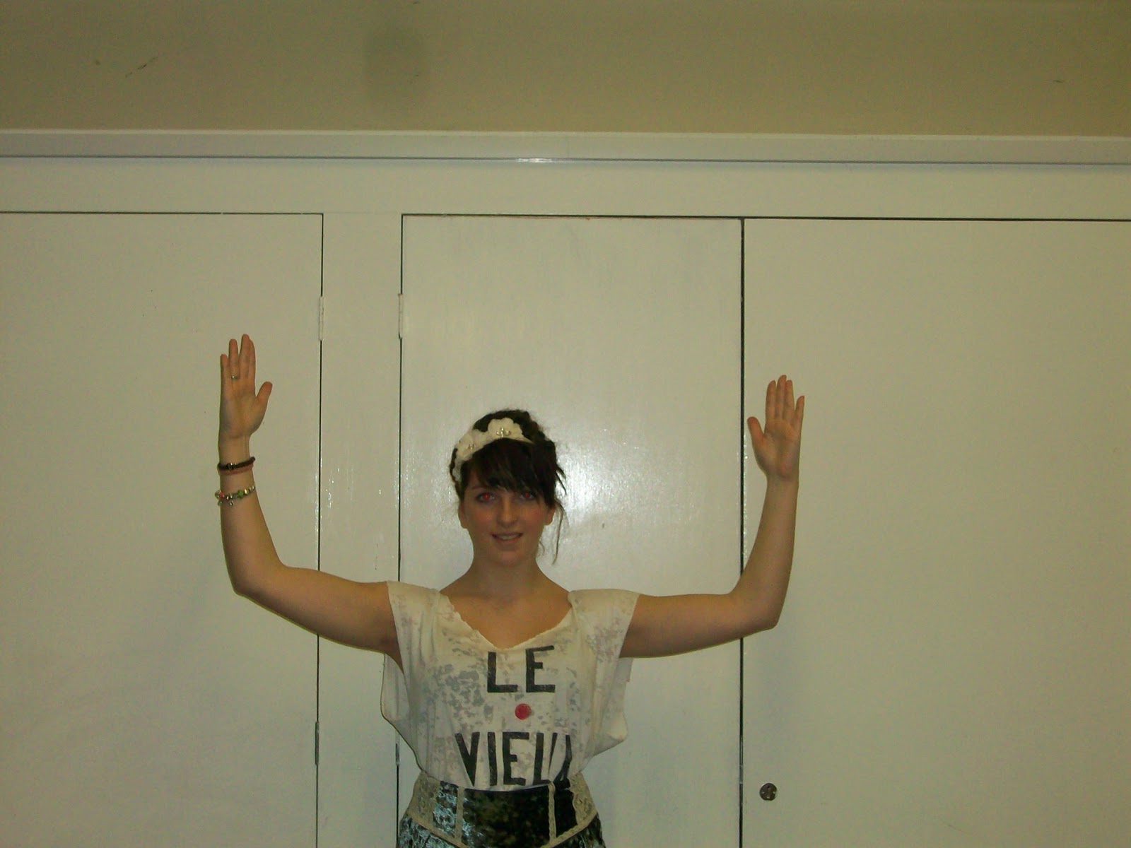


These are the next lot of test shots that i have taken of my same model, i tried some more poses from different angles. I would like the ones where my model is sitting on the floor for mny contents page, i think it would look good along the bottom and if she was wearing the right clothes this would create a good style for my magazine. The one where her arms are up i thought this would be good to use to put the title inbetween of her hands, im not sure if i am going to do this or not yet though. I want my model to be wearing colours that will look good with the pastel colour of my background which i think will be a turquoise or blue colour like the ones in my mock. For my front cover i want my model to be looking at the camera i think, i am going to take some more photos and with another model as i want two. I want a different one on my contents page to my front cover and double page spread. I want to have at least three different shots, i think i want a midshot on my front cover and definatly a long shot on my double pag spread but with more pictures aswell.
Tuesday, 1 February 2011
Inspiration and Research
After making the mocks for my magazine and looking at test shots i decided to have a look on the internet at different poses, photoshoots and magazines at how to make my magazine look morte creative and it will help make my magazine the sttyle i want it to be, before i took more test shots i wanted to look at more poses because now i have a better idea of what i want my magazine to look like. I want about 6-10 photos in my magazine, however i know that i have to take alot more testshots. I am going to have two different models, one for the contents and double page spread and another on the contents page to make my magazine look more realistic and stylish.
These are the poses i looked at ;

I like this mid shot picture , a mid shot is what i think i want on my front cover. I like how simnple this one looks as she is pulling quite a natural smile and because she is looking straight at the camera it will attract peoples attention.

I like both of these pictures because of the poses, i think that these are the poses i will look at for my contents page for just some little pictures to give my readers an idea of what is going to be in my magazine.

I like this pose, however i think that if it was going to be on my front cover it would have to be abit closer to my model. I like the way she is looking away from thhe camera and i will try and take some of these kind of poses in my test shots.

This is the kind of pose i will look at for my contents page. The pictures on my contents page should also show the style of my magazine so therefore i need to think carefully about what my model will be wearing aswell.

I like this pose for the front cover of my magazine, i think that when the modl is looking at the camera it attracts attention, i also like the style of this picture it is quite a sophisticated photo.

I would like to take some test shots of a pose where the models body is turned away from the camera but her head is turned towards it, i think this would either be a nice idea for the front cover or a smaller photo on the double page spread.

I really like this kind of pose for my double page spread, i think it would show the style of the magazine and the personality of the person, also i could show this through clothing because i would want this to be a long shot on my double page spread.

I like how simple this looks, it is a very natural picture and i think this would look better on a front cover than anywhere else.

I like this style of picture for my double page spread, it looks fun and shows through personality and these style of pictures will look good for the smaller pictures or my main picture on my double page spread.

I like this photo because of the way she is looking at the camera because i think it attracts attention , this is a good style for the front of my magazine because i want the photo to look quite simple and elegant.

I like the way the model here is looking at the camera for the front cover however overall i think this style of photo would be good for one of the smaller pictures on my doubl page spread.

This is a nice image that has inspired me to take some test shots like this for my double page spread, however i dont want to have a background on this so i would have to make sure it has the same look but on a white background.

I like the look of this picture and would also be a good one for the front cover of my magazine, however i want it to be more of a midshot than a close-up so will try this on my test shots.

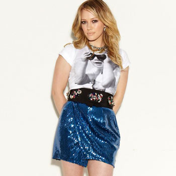
I like the style of this photo, possibly for my double page spread, i think it is good because it can show the persons clothing and this will help to show the style of my magazine.

This is the kind of picture i want for my main photo on my double page spread, i like the pose and also how the model is not looking at the camera because there will be more photos on my double page spread than just the main one.

I also like this for my double page spread or front cover, it is good becase of the pose and the way the model is looking at the camera to draw attention i think. I also liek how it shows the style of the magazine and the person.
These are the poses i looked at ;

I like this mid shot picture , a mid shot is what i think i want on my front cover. I like how simnple this one looks as she is pulling quite a natural smile and because she is looking straight at the camera it will attract peoples attention.

I like both of these pictures because of the poses, i think that these are the poses i will look at for my contents page for just some little pictures to give my readers an idea of what is going to be in my magazine.

I like this pose, however i think that if it was going to be on my front cover it would have to be abit closer to my model. I like the way she is looking away from thhe camera and i will try and take some of these kind of poses in my test shots.

This is the kind of pose i will look at for my contents page. The pictures on my contents page should also show the style of my magazine so therefore i need to think carefully about what my model will be wearing aswell.

I like this pose for the front cover of my magazine, i think that when the modl is looking at the camera it attracts attention, i also like the style of this picture it is quite a sophisticated photo.

I would like to take some test shots of a pose where the models body is turned away from the camera but her head is turned towards it, i think this would either be a nice idea for the front cover or a smaller photo on the double page spread.

I really like this kind of pose for my double page spread, i think it would show the style of the magazine and the personality of the person, also i could show this through clothing because i would want this to be a long shot on my double page spread.

I like how simple this looks, it is a very natural picture and i think this would look better on a front cover than anywhere else.

I like this style of picture for my double page spread, it looks fun and shows through personality and these style of pictures will look good for the smaller pictures or my main picture on my double page spread.

I like this photo because of the way she is looking at the camera because i think it attracts attention , this is a good style for the front of my magazine because i want the photo to look quite simple and elegant.

I like the way the model here is looking at the camera for the front cover however overall i think this style of photo would be good for one of the smaller pictures on my doubl page spread.

This is a nice image that has inspired me to take some test shots like this for my double page spread, however i dont want to have a background on this so i would have to make sure it has the same look but on a white background.

I like the look of this picture and would also be a good one for the front cover of my magazine, however i want it to be more of a midshot than a close-up so will try this on my test shots.

I like the style of this photo, possibly for my double page spread, i think it is good because it can show the persons clothing and this will help to show the style of my magazine.

This is the kind of picture i want for my main photo on my double page spread, i like the pose and also how the model is not looking at the camera because there will be more photos on my double page spread than just the main one.
I also like this for my double page spread or front cover, it is good becase of the pose and the way the model is looking at the camera to draw attention i think. I also liek how it shows the style of the magazine and the person.
Friday, 28 January 2011
First Draft Article Questions
When you first started singing did you think you would get this far?
Not at all, I always hoped that this would be my career and have always loved singing but no I never thought I would get this far, I feel so lucky. It still doesn’t feel real sometimes.
What inspires you to write your own music?
All of the songs I write mean something and come from my experiences and emotions.
Who inspires you/ who is your idol?
A lot of current artists inspire me; I would say my favourites at the minute are probably Pixie Lott, Cheryl Cole, Rihanna and Beyoncé.
How was it making the music video?
It was so much fun being in America, I loved it.
What song do you enjoy preforming the most?
Er I don’t think I could pick one particular song, because I wrote them myself and they all mean something to me and relate to my feelings and life. I like all the songs from this album.
What do you enjoy most about your job?
Everything, I love performing, writing music, doing signings, meeting the fans and travelling, the people I work with make it so much fun although it can be hard being away from home for so long at once.
What has been one of your biggest highlights from making this last album?
I just loved the people that I worked with and we got to go to some amazing places, we stayed in America for three weeks and it was great, I got time to have a look at the attractions and also do some shopping.
Who is the most inspiring person you have worked with?
I have worked with a lot of amazing people. I love working with Louie Spence, he was so funny and is his work is amazing.
How long have you known you wanted to do this as a career?
Since I was very young, I use to sing at school in productions and competitions, I always enjoyed singing since I was about seven and then started taking it more seriously a few years later and knew that it was the only thing I wanted to do.
What’s next for you?
I’m on tour next year with this album and then just taking time off for a while and spending time with my family I think and then we’ll see what’s next.
Pitch Feedback.
I have taken into consideration the comments i have had back about my pitch, people said they like my idea of pastel colours with the black which is what i have also shown on my mock ups of my front cover,contents and double page spread although more colours need to be put in my double page spread. Also it was mentioned that a mix of creative fonts may look too disorganized however i have used three main ones on my mock of my front cover and i think that they go well with each other and suit the style of my magazine. I have used the font of the title to link to rest of the pages and used the same font for them titles as well , i think it was a good way to show a link and look sophisticated throughout my magazine.
Test Shots

This is a long shot and i like the stance of the model here however i think i want to use a midshot on the front cover of my magazine as i think it will then be more focused on my model.

This is a midshot like the photo before , i dont think i am going to do it like this though because the model is turned to the side and you cant see her legs therefore i think it would look better if she was facing the front.

I like her hand beiing on her hip here however i think because she has long sleeves on it is not easy to see this, this would be if i wanted to do a shot like this i would have to think about the clothing more.

I really like this mid-shot, i like that my model is looking straight at the camera and is facing forward. I think if she is looking at the camera it will make the audiance feel more like she is looking at them and this would attract their attention.

I also like this mid-shot and the pose the model is doing it in. However i think if i used it i needs to be a bit closer up of my model.